|
Although the horror deck feels really specialized when you first look at it., it does give results for exactly those moments you need a little randomization: when the PCs enter dark alleys or empty rooms, when they are confronting something but aren't sure what it is. When the plot stalls and they aren't sure what to do next. In those specific moments, the deck really shines. In the not-so-horror moments, the deck provides some weird results so its best not to use it. The trick I found though is that you don't really need the deck during most of those moments anyway. Keep drawing cards so the PCs don't notice any pattern to your drawing, but learn when you need to use the results and when you don't, because this deck isn't generically useful... it seems specialized to help for particular situations that are usually kind of dull without it. This deck helps you take those moments that are usually skipped and glossed over and make those moments interesting... those moments that really emphasize the horror genre. When you enter the dark room. When you are about to open the door. When you open the mysterious package. When the lightning flashes. When the players examine a room feature that isn't otherwise important.
Without the deck: Is there anything on the desk? Yeah, that's some paper and pencils, and a notebook with a lot of checkenscratch on it. It looks like some of the pages have been ripped off.
With the deck: Is there anything on the desk? There's a wet newspaper on the desk. A tipped over unmarked brown bottle has spilled liquid all over the desk. It has a sickly sweet smell to it, like fregrant candy.
Is it today's newspaper? Ummm... no. This paper was dated 5 days ago. As you pit up, you have this sudden sensation that someone is watching you.
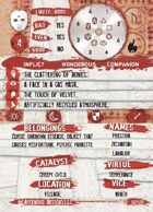
It's a good product, but I can't recommend it... mostly because of the layout and graphioc design. I printed out the whole deck to use during my sessions, and very often I can't read the card. In the heat of the moment, everything has to be quick and streamlined. That was the beauty of one deck for all this stuff in the first place. I'm running the game in a game store under florescent lighting, and I have to read text that is very tiny, written in a "horrific" font, with a partially transparent background... it doesn't work. On the PDF, things look clear because the size is so huge, but when printed out... it's a problem. A big problem. And what gets to me is all the white space on the card... it seems like some of those letters could have been bigger or used a font that made better use of the space. Even the die results are tiny, which is strange considering how much space looks available on that wheel. The problems get even worse if you sleave the cards in plastics. I don't know if the POD product has the same problem, but I don't see why it wouldn't.
The basic set, on the other hand, looks laid out well. It doesn't have a background. It's grisp, clear, neat, with specific text boxes. Even the icons look easier to read without that dark red background. I'm looking forward to getting it soon.
Get the basic deck. Judging by the content in this product, the basic deck is totally worth it. It will be easier to read and probably applicable to many more situations. I recommend this product only to people who already have the basic deck and are used to using it.
|